The Open Table of outdoor gear rental.
Gearo
Gearo is an outdoor gear rental site based in Colorado. This marketplace automates gear rental and sales to simplify the booking process by connecting gear seekers to specialty retailers.
Role
UX Designer
UX Researcher
Tools
Sketch & Figma
InVision
Xtensio
Mural
Otter.ai
Zoom
Deliverables
Market/User Research
User Testing
User Flow
Usability Tests
Site Map
Annotated Wireframes
Hi-fidelity Wireframes
Problem
Our team was brought in as a last ditch effort to improve the customer’s check-out process of renting equipment through Gearo’s website.
Research
We conducted rounds of interviews to gather qualitative data with outdoor enthusiasts from around the United States to ask them what they thought about Gearo’s existing platform, and what they would like to see.
What’s working?
The concept of gear rental is useful and necessary.
Customers love that Gearo focuses on small shops.
Design is bright, clean, and inviting.
Very affordable.
What’s not working?
The drop-down menu was overwhelming.
There are no reviews about condition of equipment.
There is a lack of clarity around how to actually retrieve the gear and shipping information.
Customer’s are only able to rent gear and not purchase.
What Customers Are Saying…
“Gear is expensive and not knowing the condition of an item could jeopardize my life. I would love to see a rent-to-buy option.”
— Expert Rock Climber, Salt Lake City, UT
“Wherever I am, I just wanna pick-up my gear and go!”
— Ski enthusiast, Breckenridge, CO
Competitor Analysis
Arrive is an outdoor experience company with a mission to create a world where you can experience the outdoors sustainably. Rent premium outdoor gear with delivery anywhere in the continental U.S.
Christy Sports offers a wide range of equipment servicing capabilities and is a provider of rental services to customers offering the latest equipment available in the marketplace.
Awayco is a software that enables you to start and grow a rental business offering your customers ways to discover new products and try before they buy.
Gap in the Market
Our competitive analysis showed us that none of Gearo’s competitors had a rent-to-purchase option, leaving a gap in the market for Gearo to potentially increase sales and revenue.
Customer Pain Points
Through affinity diagraming and empathy mapping, using sticky notes, we were able to empathize with our users and determine the most important friction points that needed to be resolved when using Gearo’s website.
“The layout feels unorganized and there are way too many products listed in the drop down menu.”
— Avid Hiker, Boone, NC
Pains
Gearo’s website is not web responsive, making it challenging to book gear from a mobile device.
No quick-pay option.
Frustrations
Products are unorganized.
No reviews or condition ratings for previously rented gear.
Goals
Rent gear from anywhere without having to bring any equipment on trips.
Visual icons to simplify gear selection.
Cut-down on gear search time.
Motivations
Affordability.
Accessibility.
More time to enjoy activity.
Creating wireframes and prototyping.
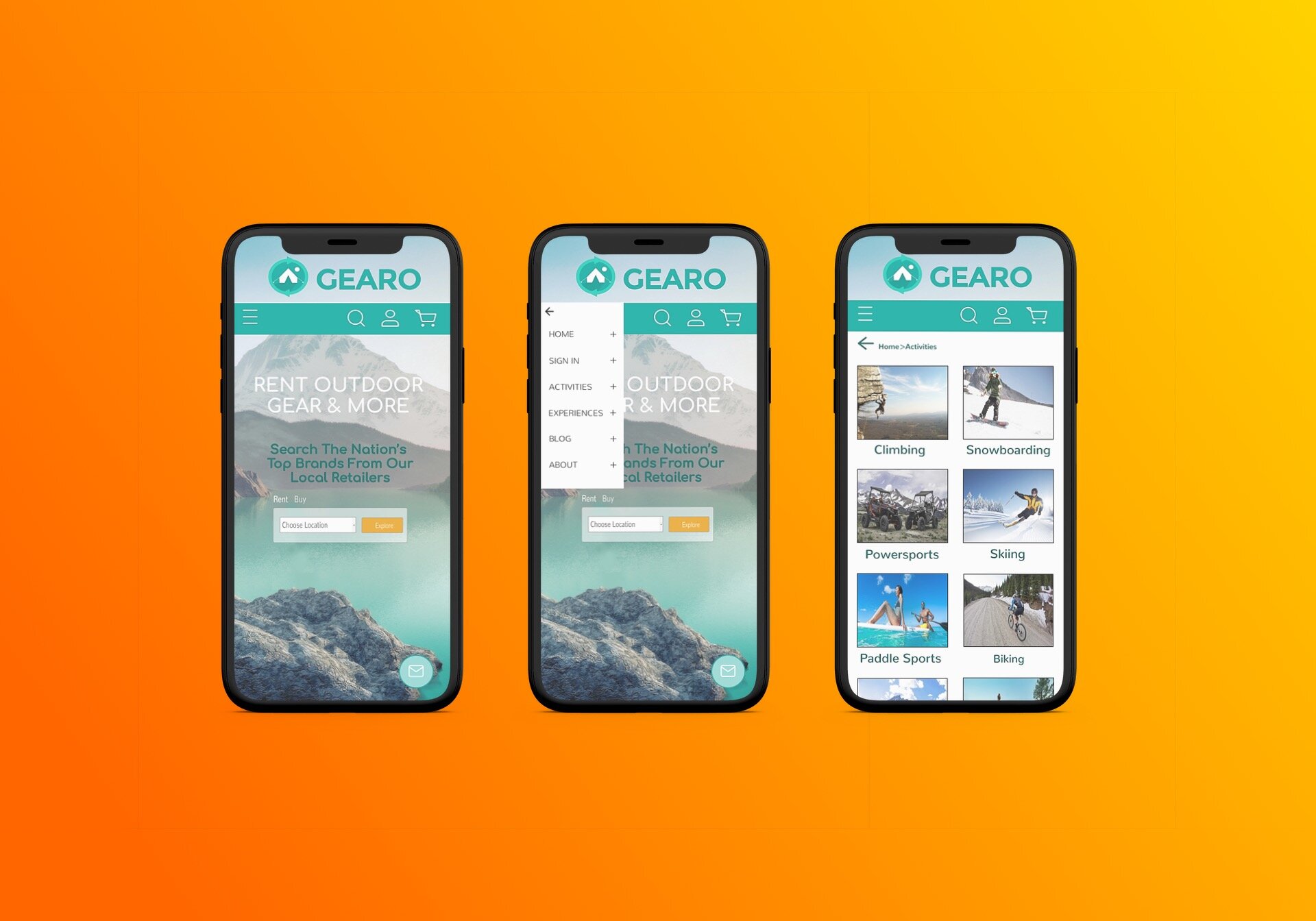
After listening to the customers, it was important to decide what essential pain-points we were going to focus on given the existing time constraints for the project. The new design would reflect the existing brand. A hamburger dropdown icon was added to alleviate lengthy scrolling, as well as, clickable image icons.
Gearo Style Guide.
Ultimately Gearo already had a very strong existing client-base. It was important to be compassionate and respectful of the stakeholder’s brand and logo so we kept Gearo’s current typeface and brand colors.

Team Goals:
Make it seamless, mobile accessible, and user friendly.
Now users can quickly select their desired activity using the hamburger dropdown icon or the clickable visual icons from their mobile device to find gear. Another feature that was added, was a quick-pay option to save more time during checkout.
Prototype walkthrough of the new mobile design.
Final recommendations for Gearo’s new website.
Initially our stakeholder was unsure on which user to focus on, the small retail shops or the outdoor enthusiasts. We went through two rounds of testing from the end users, and ultimately decided to focus on the customer (outdoor enthusiasts). We listened and empathized with their needs and were able to implement a few features. Our final recommendations for Gearo’s development team to design:
Rent-to-purchase option
Quick-pay
Hamburger dropdown icon
Visual clickable icons
Reviews/item ratings
To see which features made the new roll out for Gearo’s website click here.


